
The Art of Persuasive Landing Pages: What Works, What Doesn’t, and Everything in Between
Landing pages are often confused with website homepages. While in certain cases, the homepage of a business can double up as its landing page, this scenario is usually the exception, not the rule. Let us first understand what a landing page actually is.
A landing page is a web page that a user arrives on after she clicks on an ad, email or text link or social media post promoting your business. Since it leads in from a promotional message, the landing page content typically matches the content of the ad and is focused on achieving a very specific result.
So, there are a few essentials that every landing page must have:
- Must be relevant to the ad / email / promotional message it is linked to
- Must have a clear conversion objective and communicate this objective in simple, easily digestible copy
- Must carry a strong headline and an unmissable call to action
- Must not distract the user’s attention from the conversion objective
- Must offer supporting facts to accelerate the conversion process
- Must be responsive to different screen sizes
- Keep forms short and relevant, removing superfluous fields
What better way to understand WHY we need these essentials, than to see them in action on real-time pages. So, below are some examples of the good and the bad of landing pages.
The Right Ad to Landing Page Match, Clear Conversion Objective with Zero Distractions
A simple search on Google is an opportunity for brands to target users with very specific ads containing keywords related to the search term. The PPC (Pay Per Click) ad that you create does half the job in making up the users’ minds about your brand. The rest is done by the landing page. Since the ad and landing page act as two halves of a whole, it is essential that they speak the same language and entice the user into a conversion.
Take the below search term for example:
The Good
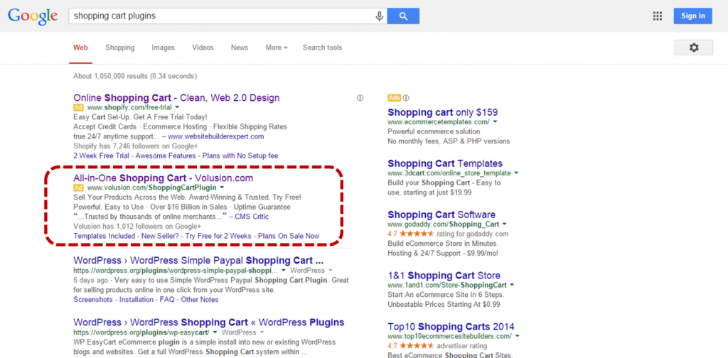
For a search about ‘shopping cart plugins’ Volusion offers a crystal clear headline with a variety of descriptors in the PPC ad itself. The ad talks about the number of businesses that currently use its services, how it is an award winning, easy to use service and so on.
The landing page linked to the ad is a perfect complement to the ad and its contents.
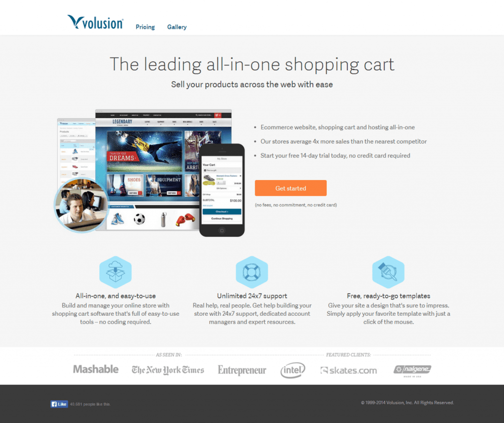
The simple and short landing page expands on the points mentioned in the ad. It tells the user exactly what Volusion can offer in as few words as possible. The imagery used is subtle, but conveys clear meaning over and above the copy – the mobile screen superimposed against the desktop screen shows that Volusion’s websites are mobile ready. The image of customer support personnel signals Volusion’s focus on customer care.
It lists a few marquee clients like Intel and respected journals that have featured Volusion like the New York Times, to further convince the user of its superiority to competition.
The call to action regarding the free trial is unmissable in bright orange, located obviously in the center of the page. The page is remarkable for being self-contained – no navigation bar to take the user away from the page, no extraneous messages unrelated to the main communication objective
All in all, this is one well designed landing page, with almost no margin for error.
The Bad
If the earlier PPC ad + landing page combo that we reviewed was bang on target, here’s a look at another such combination for the same keywords that veers WAY off the mark.
Besides offering website hosting solutions, Go Daddy also offers shopping cart plugins. For the same search term as earlier, Go Daddy offers the following ad.
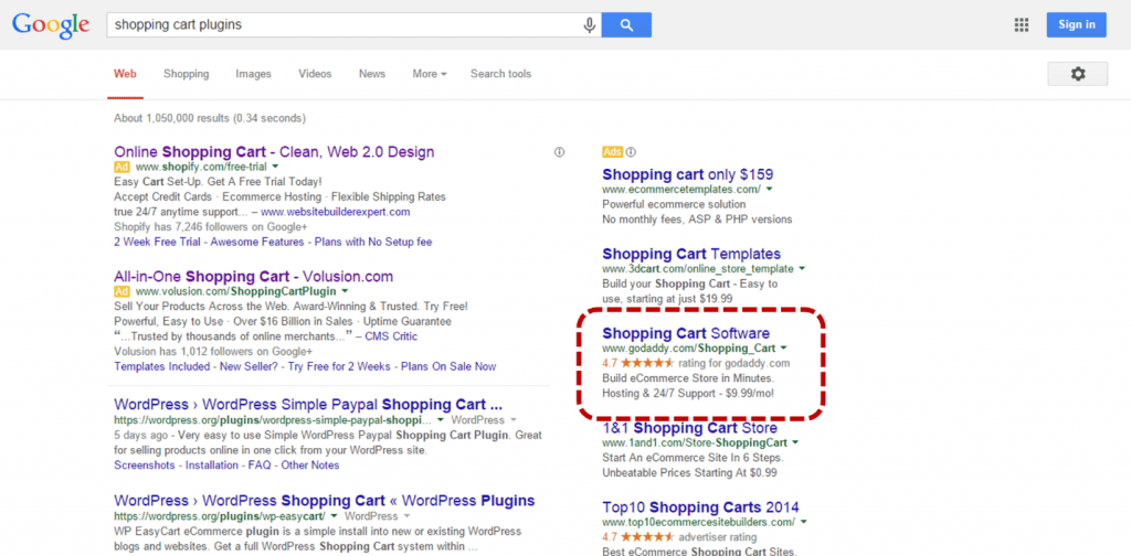
The ad focusses on 3 aspects of the service – build your site quickly, get hosting & 24/7 support and pay just $9.99/month. That’s not bad for an ad. Now let’s see how this ties in with the landing page.
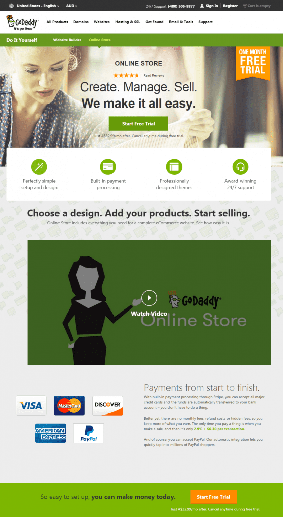
The headline and supporting copy are pretty straightforward and connect well with the ad. However, the rest of the page seems to take on a life of its own.
From the profusion of colors and fonts on the page to the seemingly unending length of the page, the user faces a daunting task taking in all the information on the page. The call to action is split between three separate buttons, each representing a complex price slab. Scrolling down, the customer is met with a demo video showing the software in action and every feature explained in detail, ending with an eight slide rotating banner talking about FAQs.
While it’s not a bad idea to speak of the benefits and features of your product on your landing page, it’s a better idea to keep it short and go into the finer details once the user clicks through to your main website or signs up for a trial and experiences the various features for themselves.
The landing page also offers user reviews as a means of making its case as a great product. Unfortunately, the way it does this defeats the entire process. There is not a single name on any review, nothing to truly lend any credibility to the reviews. The least they could have done to establish some level of credibility was to offer real names and pictures of the users alongside the reviews. The reviews themselves could do with being a little longer than a one line quote (or one word, in some cases!) and could have spoken about users’ individual experiences with Go Daddy’s product.
Detailed Product Information with a Clear Call to Action
We tackled the problem of an over-informative landing page in the previous example. This section does not aim to negate what we discussed earlier, but calls for a judicious balance between too little information and over the top information.
A user arrives at a landing page to learn more about your product. Give them the information they need to make a purchase decision, but make sure the information is presented in a way that is easily understandable and aesthetically appealing. The last landing page we saw had crippling clutter and overwhelming page design as the key flaws holding back the landing page from being a truly useful one.
Then there is the matter of your CTA. No matter how great your ad looks, irrespective of how awesome your landing page is; without a clear call to action you are looking at a pile of wasted marketing budgets. A call to action on your landing page works best when it is consistent visually and in meaning to the call to action in your ad. It helps to have your CTA stand out with the right mix of colors, placement and repetition (if necessary).
The Good
Best Buy remarkets ads based on specific search keywords. On searching for a Nikon D3200 Camera, I was served this display ad in my email inbox:
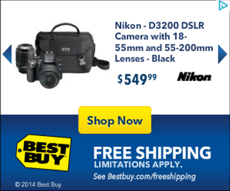
With detailed information on the model, the exact price point, added benefits like free shipping, I was armed with all the essentials to make me click on the ad and reach the landing page.
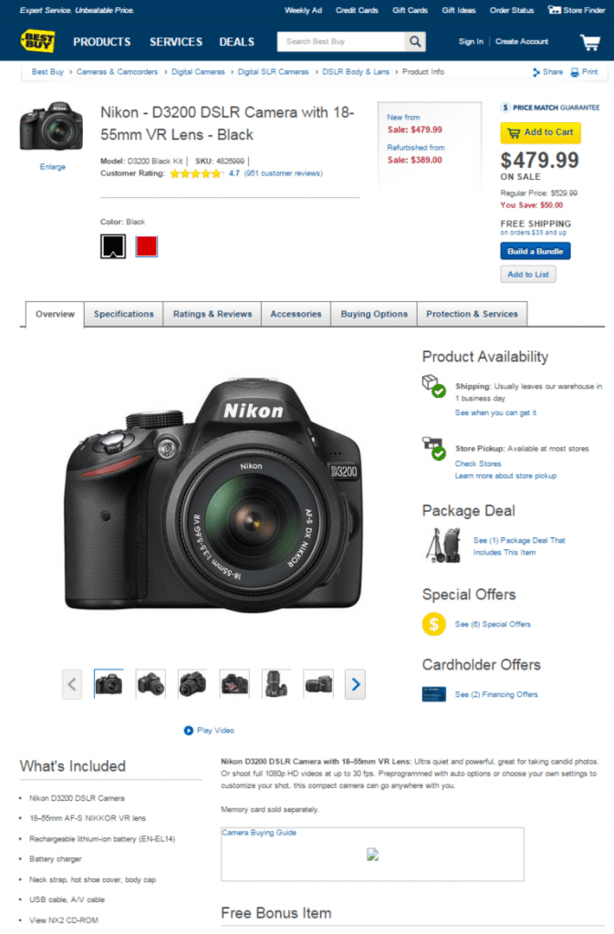
The landing page in the case of Best Buy is a product page for the said camera model. It picks up where the banner ad leaves off and delves into specifics about the model, its features, shipping information and more. Neat tabs on the page offer information about various aspects of the product letting the user take in the vast quantum of information in small bites. The usage of white space as a means of letting the page design breathe helps the user navigate around the page easier.
Key benefits that will help the user convert are proffered upfront at the top of the page. Nearly 500 product reviews from real users make a strong case for the product. A ‘Sale’ price accompanied by the ‘Before Discount’ price shows the user the great value they are getting and play on a key element of user psychology – the price anchoring effect. Other enablers like free shipping are also highlighted in the top half of the page, adjacent to the CTA.
Overall, the page takes care of most principles of good landing page design except a couple. A key decision element like Best Buy’s price match guarantee and product Q&As which are important for a technology product like a DSLR camera are buried nondescriptly at the bottom of the page.
The Bad
If the Best Buy page spelt out what TO do with product specific landing pages, here’s an example of what NOT TO do with them.
Kellogg’s Special K has a flash banner that promotes their bacon flatbread breakfast sandwiches. Since Special K positions itself as a weight loss product, the ad emphasizes on the calorie count of the item but gets even this critical element wrong. If you notice the copy at the very top of the first banner mentions 240 calories, while the immediate next slate of the banner says the product contains only 220 calories. The call to action is pretty clear – Users are urged to click on the button to learn more about the product.
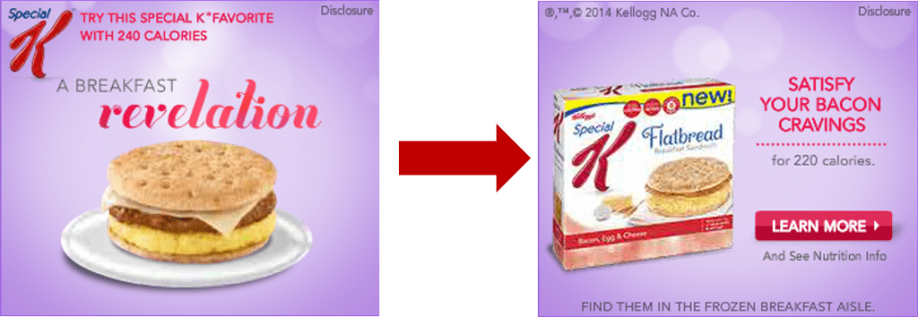
But clicking on the ‘Learn More’ button proves to be an even more confusing experience. Instead of giving more information on the Bacon Flatbread Sandwich, the landing page just promotes five other variants of Special K’s flatbread product line, without a word more on the advertised product.
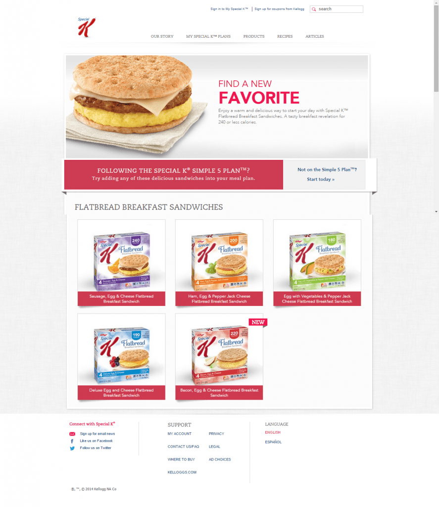
None of the product variants displayed are clickable – a colossal waste of precious real estate. In fact, the only clickable element of this page is the barely noticeable grey button that contains a CTA completely unrelated to the banner ad or the rest of the page – it talks about Kellogg’s Simple 5 Diet Plan with no reference to context.
With no ‘reasons to believe’ offered to users, no compelling CTA, and most importantly no product information at all after a bold ‘Learn More’ CTA on the ad, this page sorely misses nearly every key element of a good landing page.
‘Reasons to Believe’ and Mobile Friendliness
Any average landing page can talk about the product it promotes to convince the user. That’s a threshold expectation. But to rise above competition, your landing page needs as many ‘reasons to believe’ as possible and offer these to the user in a credible and easy to read manner.
Typical reasons to believe include:
- Product ratings and certifications from recognized industry bodies
- Awards and recognitions
- Detailed testimonials from existing users
- Number of existing users (if the numbers are significantly large)
Most factors in the list above are pretty straightforward, except user testimonials. Like we saw in the Go Daddy example earlier, testimonials can do more harm than good if they are not done in the correct way. Reach out to your existing customers who are happy with your service to offer a description of their experience with your brand. Ask them to specify how your product solved their problem, instead of simply getting generic compliments from them. Use these testimonials in combination with the name and image of the actual customer to add to the credibility of the testimonial.
Another key feature of a landing page is that is must be mobile friendly. With mobile internet usage now having overtaken internet usage through PCs, there’s no reason left to ignore the boom in mobile devices any more. Having a mobile friendly website is a given, a mobile app is a necessity; but few give much thought to making their digital marketing landing pages mobile friendly – an oversight that will prove costly in the days ahead.
Let’s examine these two factors with examples from further down on the right side of Google SERPs – ones that a user would have to scroll to get to.
The Good
The search term accounting software, offers the following list of choices, of which I’d like to examine the landing page for the Freshbooks ad.
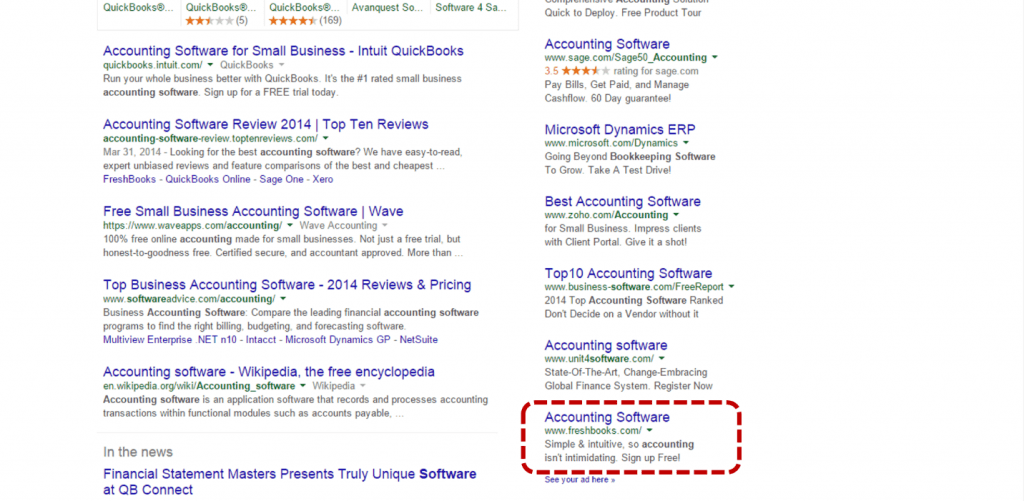
The ad speaks of Freshbooks’ USP of simple accounting for the layperson and tries to draw the reader in with a free sign up offer.
On clicking through to the landing page, a user is not disappointed.
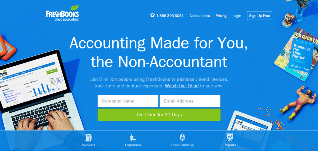
The same confidence inspiring language continues and the user is offered two immediate reasons to believe – the fact that Freshbooks has 5 million users and their TV commercial which acts as another convincing tool.
Instead of rattling off features of the tool, the page then proceeds to tell users every single benefit that they will get out of the tool – in simple, easily digestible morsels. The quotes from respected magazines like Forbes and CNet help make its case stronger. Certain things stand out on this page that make it a clear winner, including:
- User testimonials are natural sounding and talk about how they help solve a real-world issue. They are accompanied by the endorser’s name, picture and website, to add another layer of credibility to the claim.
- The page offers screenshots of key features of the Freshbooks tool, showing off its design and usability credentials – a very important factor when it comes to selling a software that will be used on a daily basis.
- Prestigious awards are mentioned with a sneak peek behind the scenes in the form of a team photograph.
- The CTA is repeated multiple times throughout the page – a very sound strategy for a landing page that is this long.
If you were still wondering about whether this beautiful landing page is also mobile optimized, yes dear reader, it most certainly is!
Just in case, you do not appreciate the near perfection that this landing page manages to achieve, let’s look at the other extreme to convince ourselves of the way to build a winning landing page.
The Bad
Right above the Freshbooks ad is the ad for Unit 4 Software.
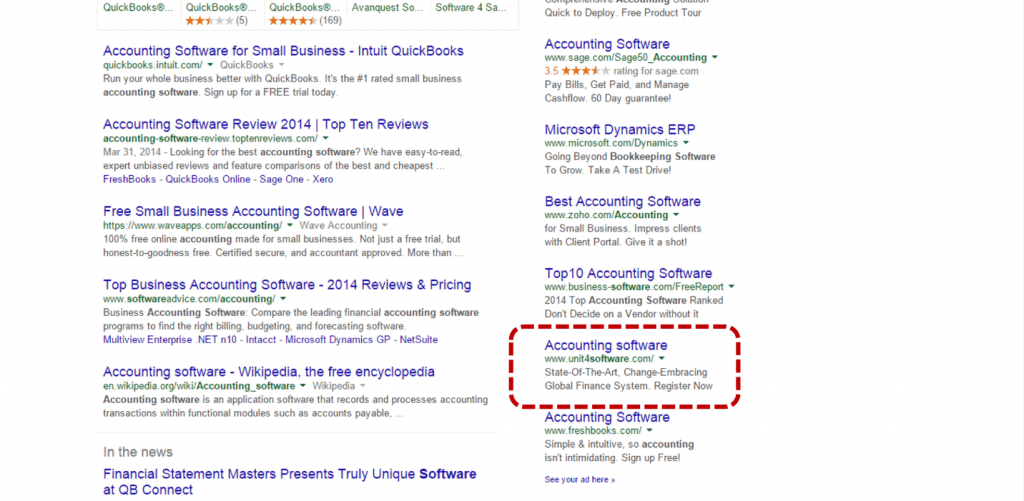
The ad itself is very vague on what to expect (change embracing?) but hope floats, and we click through to the landing page.
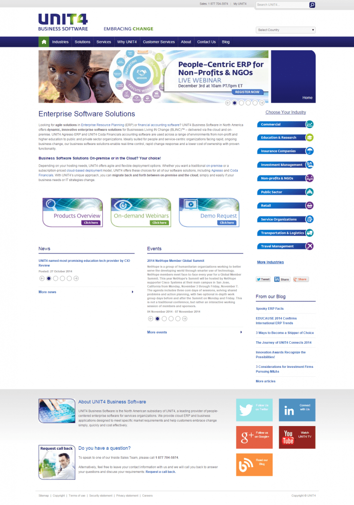
The landing page does nothing to alleviate this sense of being a little lost. In one glance across the page, you notice that the only call to action on this page has nothing to do with the accounting software. It is a registration call for a webinar about an ERP system, of which this accounting software is presumably a part of.
The rest of the page is a wall of text with nothing standing out to catch the user’s eye or make a clear point about the software’s merits. There’s a short and to the point form on the page that probably offers information about the tool in return for the user’s details. However, with a monthly newsletter/blog subscription thrown into the mix and the CTA button that says ‘Download’ you’re really confused about what to expect on submitting that form.
There are no external positive reinforcements to help the user choose Unit4’s financial software over others – no user recommendations, no awards, recognitions or even a mention of the size of their existing user base.
By now you almost expect it to not be optimized for mobile browsers, and you’re proven right. All in all, this page screams out to be rescued from a fate of miserable conversions.
In Closing
Remember, a landing page is not a website, it is a very precise tool created for a very specific purpose – conversions.
Instead of following your gut or general webpage design guidelines on your landing page, switch to the recipe we outlined in the beginning for a good landing page.