The Evolution of Apple’s Website
Since the rise of the Internet in the 90s, we’ve all been on a journey that continually propels forward. Rarely do we take a moment to contemplate what the websites we use today evolved from. But with most websites being updated every 2-3 years along with the rapid rate at which both technology and design principles have changed it can be an interesting (and entertaining) exercise to look back.
While there are many examples we could have chosen, we’ve decided to focus on Apple.com’s evolution;
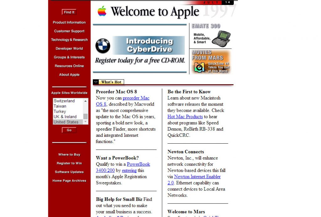
1997: It’s hard to believe that the sleek design we are used to associating with Apple.com evolved from this. But note that even back in 1997 Apple had ‘worldwide sites’ and was focused on content!
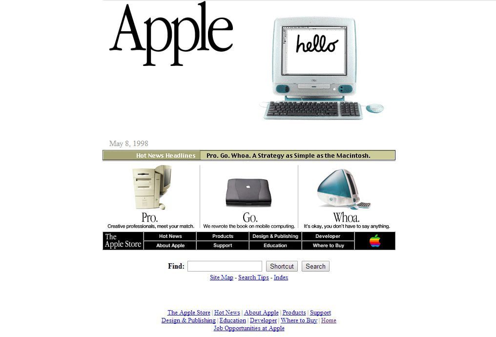
1998: A new computer launch and a new website design! Looking a little more like the site we are used to seeing, and a strategic shift in focus from content to product.
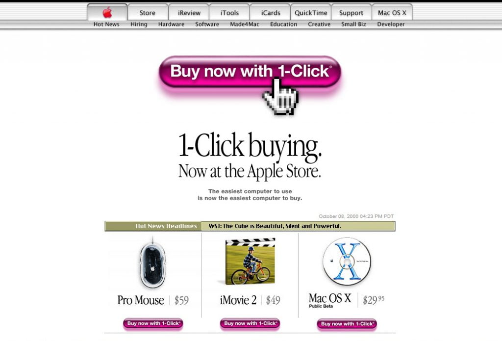
2000: The new millennium, and another new design with the navigation menu finding its home at the top and the introduction of ecommerce for Apple.com.
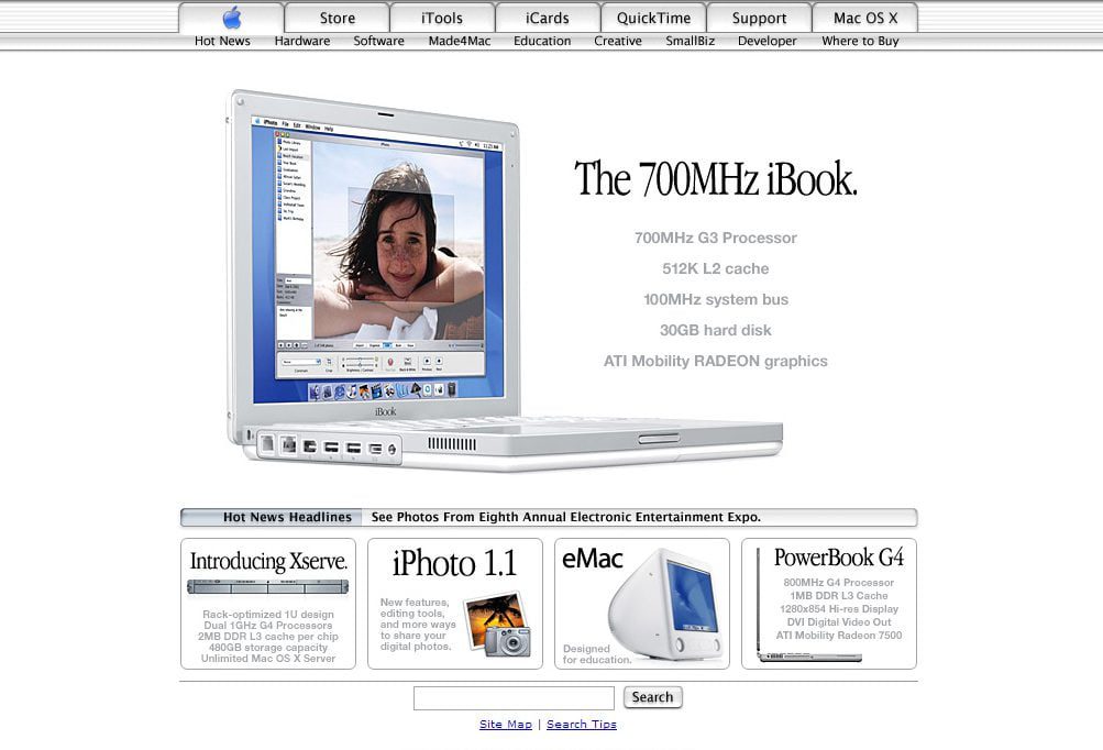
2002: A slightly sleeker design, reminiscent of the white on white Apple designs we were seeing at the time and a subtle change from red to blue for the Apple logo.
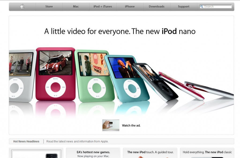
2007: Fast forward a few years and the website receives a complete refresh, with more streamlined navigation, search bar being added to the now conventional top right position and the introduction of video clips to the homepage.
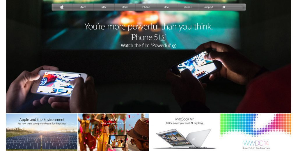
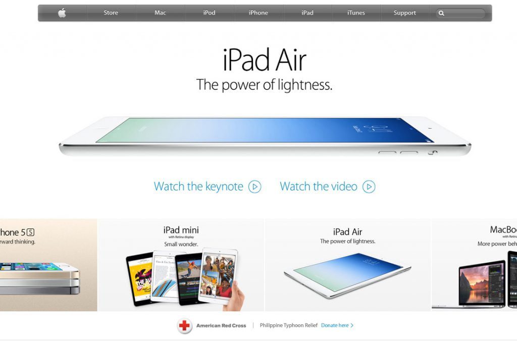
2013: In response to the wider screen resolutions that are more common these days Apple extended their homepages, however maintained the clean powerful hero imagery.
2014: In keeping up with the latest in design Apple.com today features a colour explosion and full page images that have quickly become the look of 2014.